Selection of cartographic works created during GIS master's degree in Madrid, Spain (in Spanish).
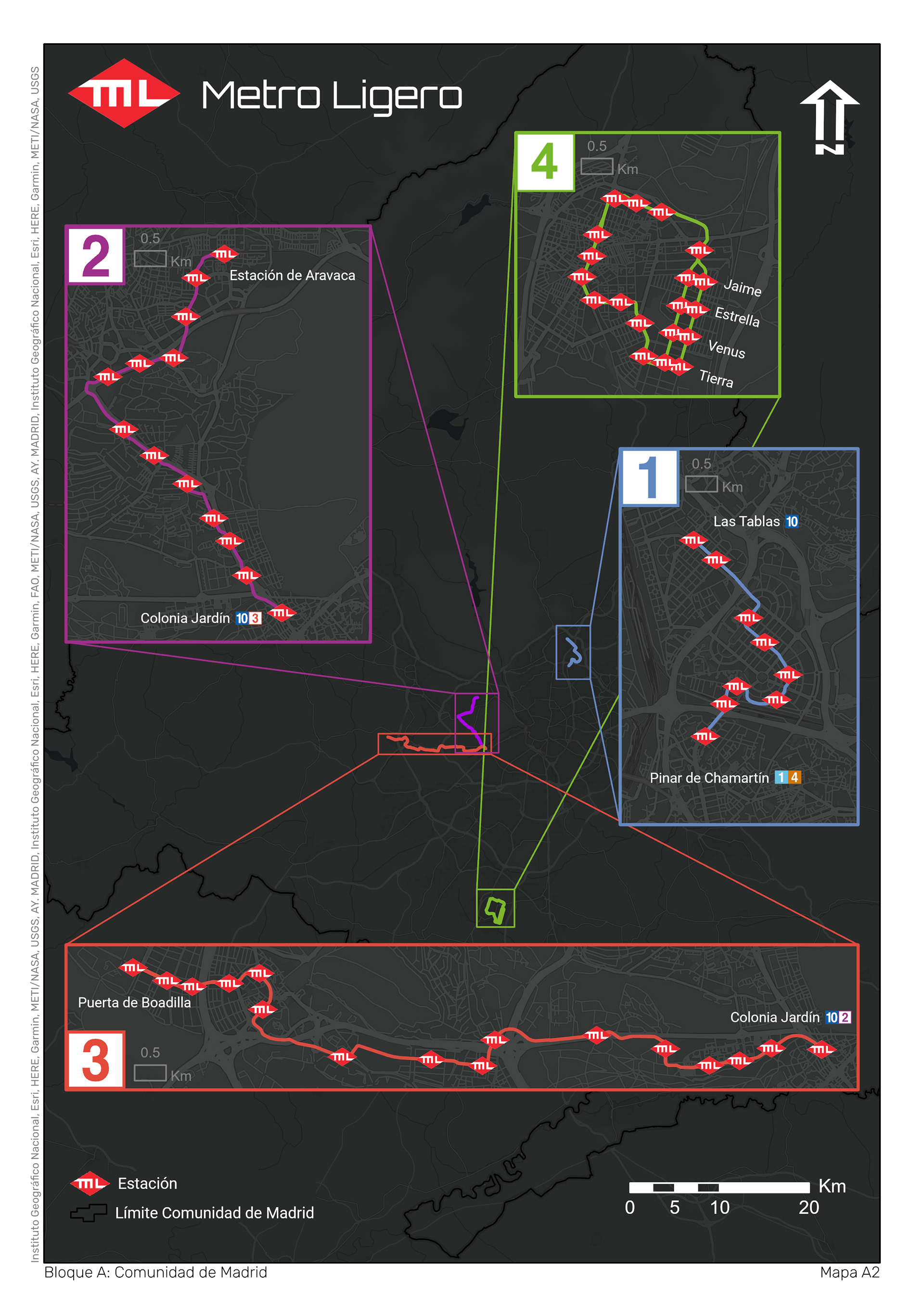
This map plots the four lines of the Metro Ligero in a single layout. To accomplish this, a locator map sits in the background, from which each individual train line protrudes as its own map on a larger scale. Location data comes from the open data portal of the Regional Transportation Consortium of Madrid (CRTM in Spanish), and every color matches those used  in official publications of the Consortium.
This map plots the four lines of the Metro Ligero in a single layout. To accomplish this, a locator map sits in the background, from which each individual train line protrudes as its own map on a larger scale. Location data comes from the open data portal of the Regional Transportation Consortium of Madrid (CRTM in Spanish), and every color matches those used in official publications of the Consortium.
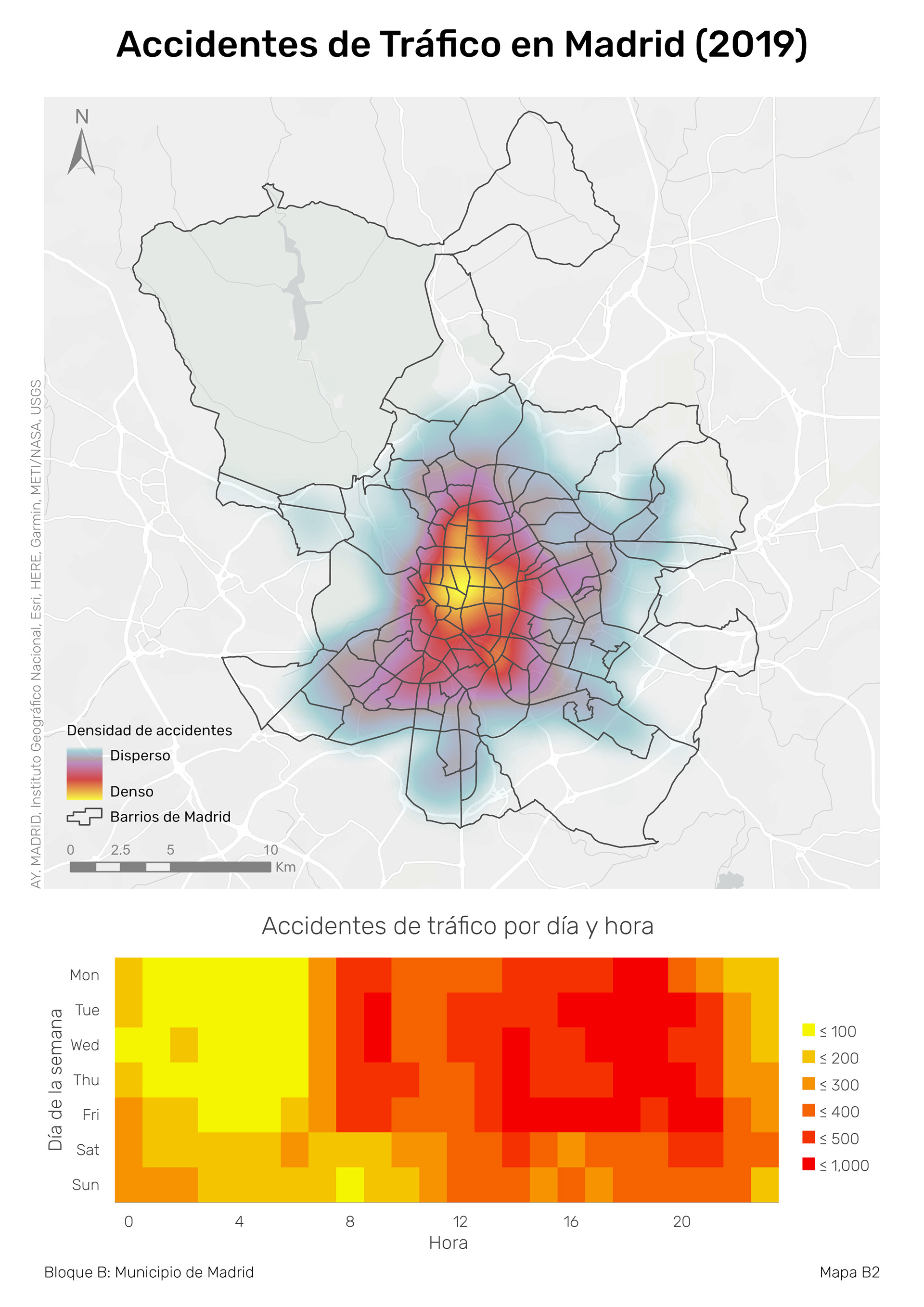
Through a density visualization, this map shows where the highest frecuencies of traffic accidents occur. A calendar heat chart complements the map to show the daily and hourly distribution of accidents.
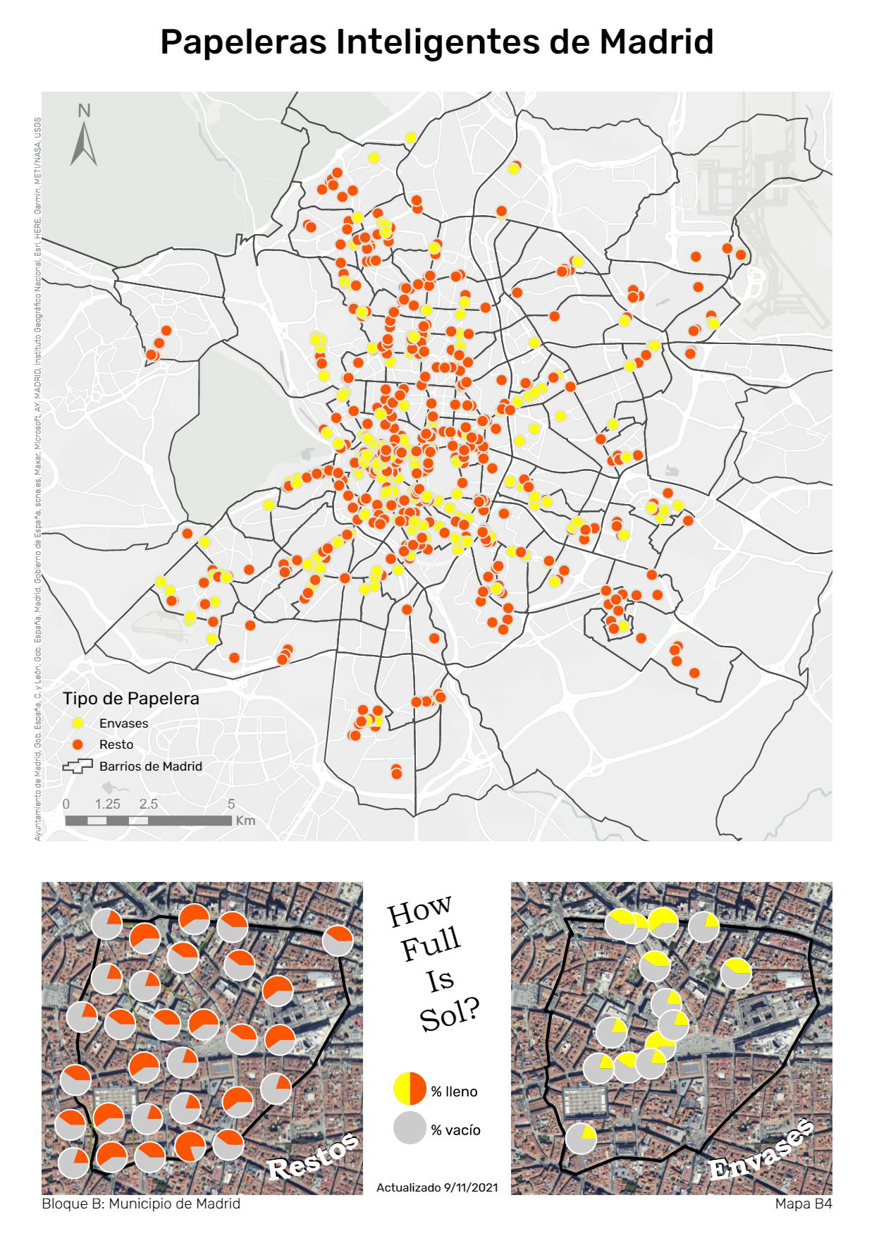
Something that's seen frequently but perhaps rarely noticed is the large quantity of smart trash cans in Madrid. Curiously, they transmit utilization data in real-time for anyone interested. The primary frame of this layout shows the locations of the trash cans by type of waste. The two lower frames represent a "snapshot" of the real-time data in the Sol neighborhood in the center of Madrid.
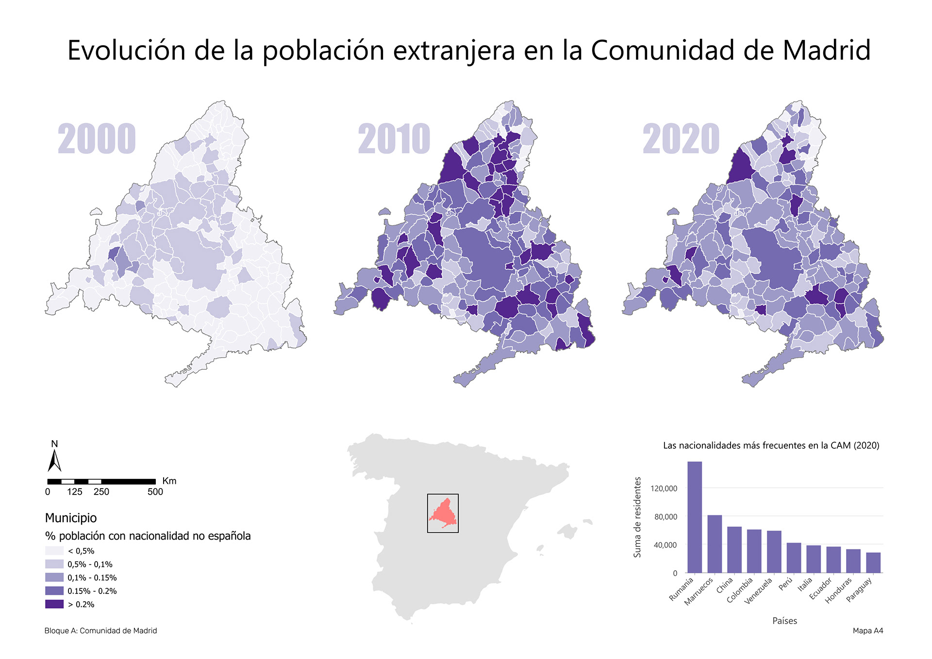
Using census data, this map shows the relative changes in the foreign population over time. As you can see, the Community of Madrid experienced high growth of this population between 2000 and 2010, but that rate of growth does not persist afterwards.
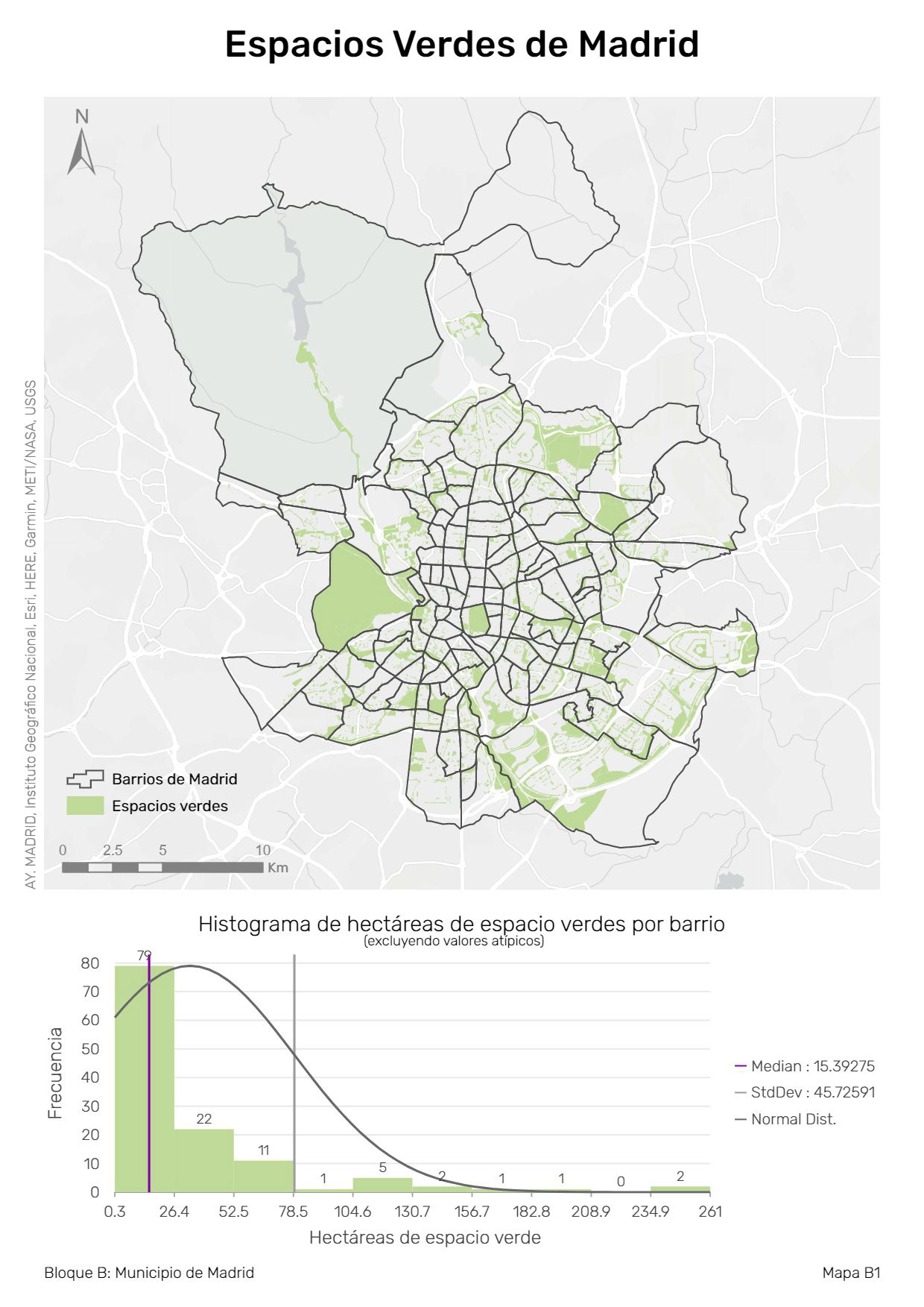
 The city of Madrid boasts many green areas like parks and playgrounds, and this map highlights those surfaces, along with the distribution of hectares of green space per neighborhood. As you can see, many neighborhoods have little green space, while a select few enjoy a large amount.
The city of Madrid boasts many green areas like parks and playgrounds, and this map highlights those surfaces, along with the distribution of hectares of green space per neighborhood. As you can see, many neighborhoods have little green space, while a select few enjoy a large amount.
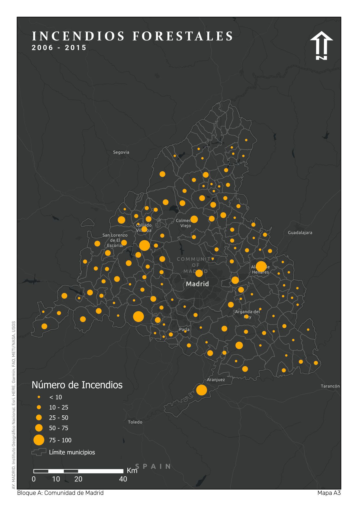
This map shows the sum of all forest fires in the Community of Madrid by municipality between the years of 2006 and 2015. Several similar maps have been published with this data, but with coropleth symbology. However, they use absolute values, which impedes the correct reading of a coropleth. Due to these limitations, I believed that graduated symbols would serve better.